A Guide to Choosing Fonts for the Web (Part Two)

By Melissa | Apr 25, 2018 (5 min read)
In the previous article, we looked at the basics of choosing fonts for practical and readability reasons. In this article, we will explore some of the more nuanced parts of selecting and using great fonts for your web design.
(Btw, if you haven’t had a chance, you might want to review the first article, as it covers the basics of choosing fonts for your website.)
In this article, we are going to look at some of the nuances that are part of good font selection.
Font Hierarchy
Some elements on a page are more important than others. In web design, the most important elements on a page have the most ‘hierarchy’, which means what you want a viewer to see first.
Titles and headlines usually are the most important part. In copywriting, the headline is often called the ‘ad for the ad.’ In web design, this is also true. The title or headline tell your viewer what to expect below.
For this reason, titles and headlines (sometimes called headers) are bigger.
The size is one way to draw attention to them. But you can also use color, weight, and placement on the page to create a clear visual hierarchy to your pages.
Leading
Leading (pronounced ledding) is the space between lines of text. It’s a subtle aspect, but an invaluable tool for readable website design. The tail (sometimes called the descender) or stem (called the ascender) of the letter are what influence the font leading.
Poor leading can ruin the copy on your page as everything feels cramped together. Lines that are too close together actually discourage people from reading what’s written, as it is too hard to navigate.
(See how the leading is causing the text to overlap? This reduces readability.)
For large blocks of text, 1.5 times the size of the text is a good leading size. Smaller text should have tighter leading, and huge text should have a lot. You have to use your judgment, but generally, the rule is, the bigger the font the more leading needed.
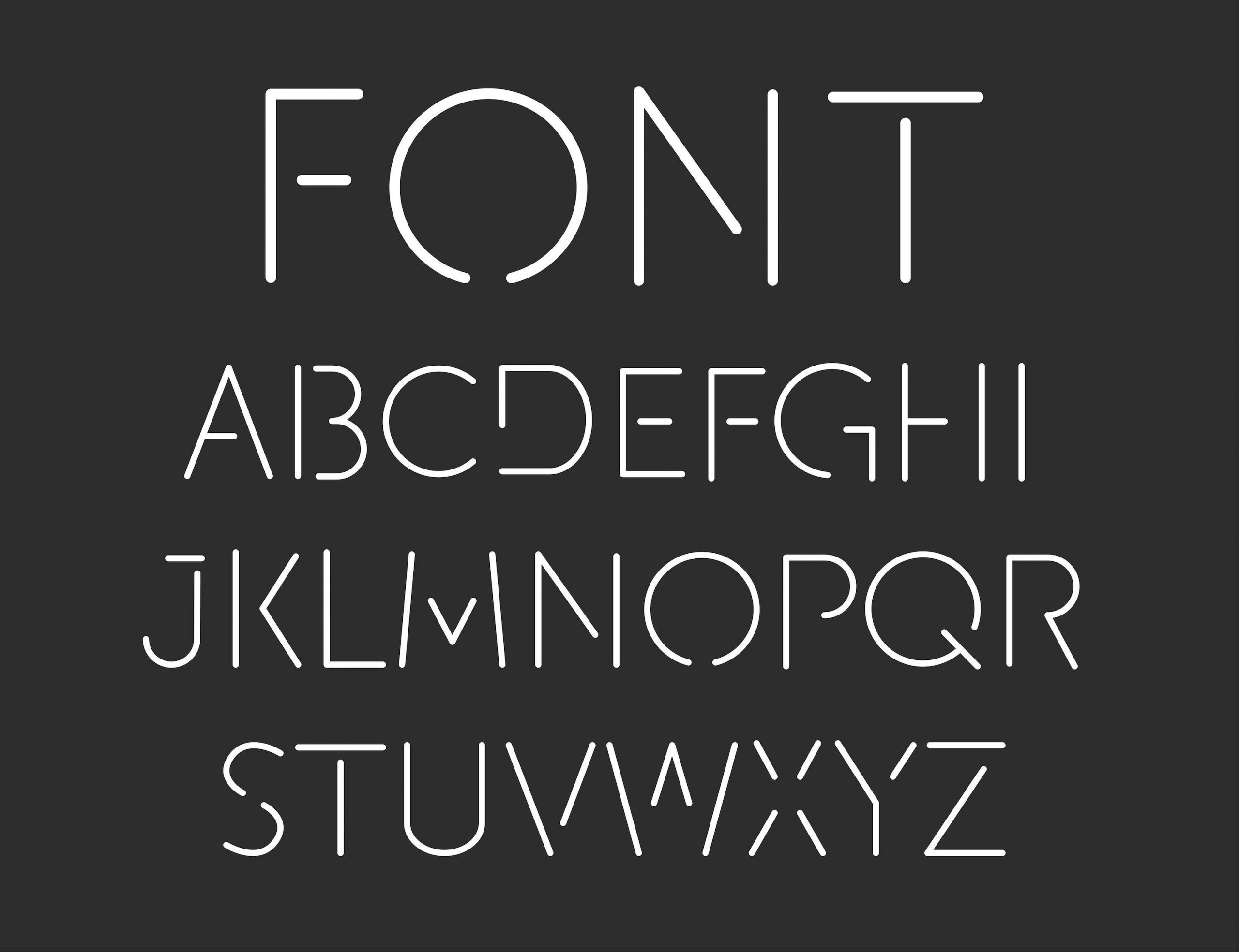
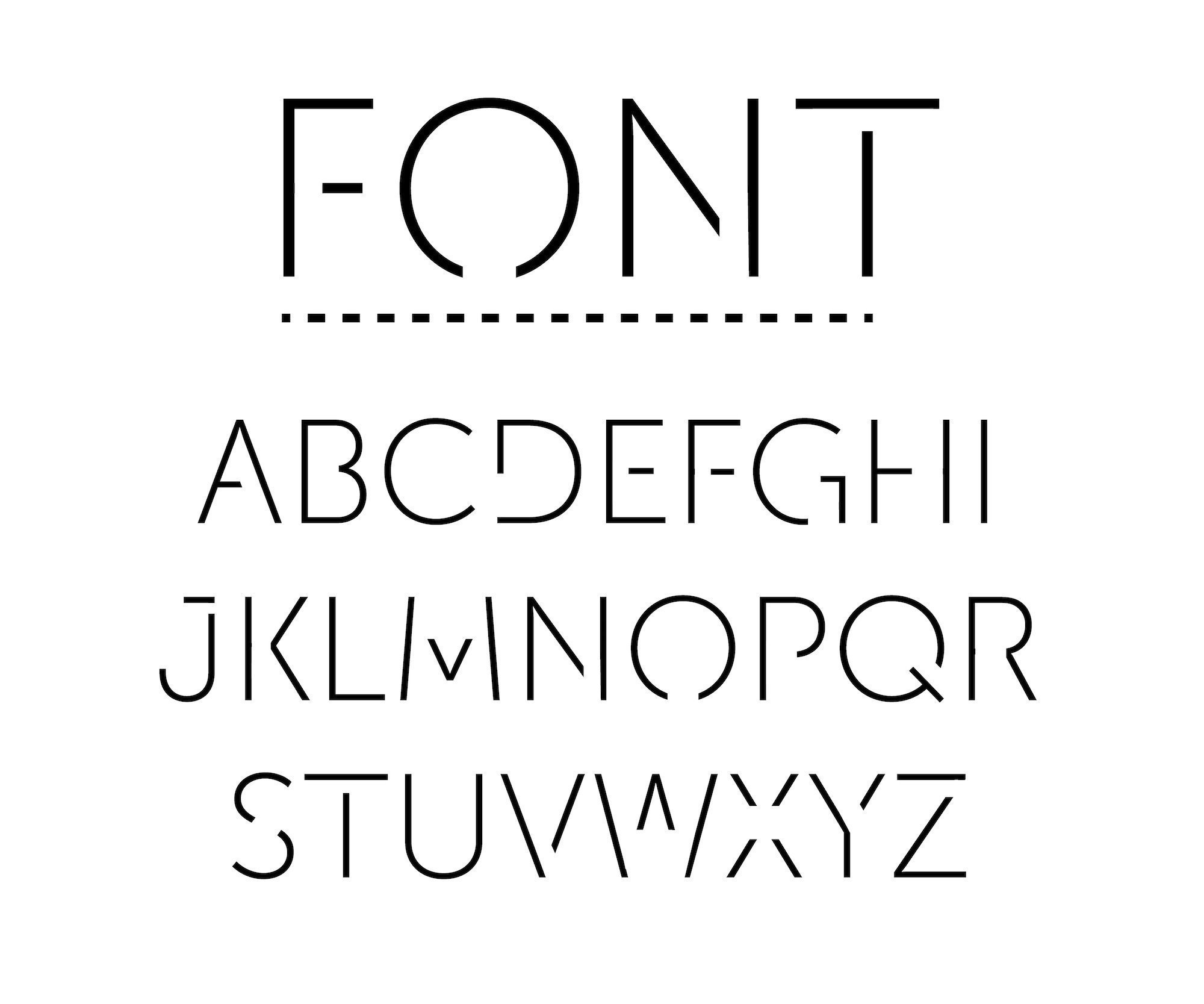
Tracking & Kerning
Tracking and Kerning are focused on the space between characters in text. There is some confusion between the two, so it’s worth explaining them.
The FedEx logo is an example of typographic mastery, and it uses both tracking and kerning.

(Notice the arrow hidden in negative space? Pretty cool, huh?)
Tracking is used to fill a space that’s larger or smaller than currently suits the font. In the FedEx logo above, most of the letters are spaced evenly with tracking. However, the letters dE and squashed together. This is an example of kerning.
Kerning adjusts space between two letters. Set too closely together, words are hard to read and set too far apart, and they become disconnected letters instead of words.
Keep in mind that changing the tracking can sometimes lead to difficulty in reading the text, but can also be used for design aesthetic when purposefully altered.
Be conscious that in some typefaces, different letters will have wider spacing and others narrower. So you need to examine how they look when displayed on the page.
Color & Legibility
While it isn’t part of the design of the typography, the color is a very important part of every website’s type. We will explore color schemes in another article, but for now, let’s focus on the basics of color and fonts.
Contrast is essential to ensure readability on your site. Black text on a white background (or light background) is considered the most readable color for text.
That doesn’t mean that everything must be set on black-on-white, but you need to be aware of the contrast of your text.
As a rule, the darker the color of text the more prominent it will be and stand out. The lighter the color the more it blends into the background.
However, this is where backgrounds come into play, the more contrast the better so the text on top of the background doesn’t get lost or blend in. Some colors even vibrate off of each other when overlapped (e.g. Red and blue). This is why choosing the color of the text on a colored background is very important.
The Grid can be your Guide
In my opinion, using the grid is very important for creating impactful typography on the web. You might have great fonts, accurate spacing, and colors, but if you don’t have a good layout it all falls apart.
Using a grid when you’re designing with type provides a clear balance and geometric structure to your design. There are four basic grid types you can use:
– Manuscript Grids
– Column Grids
– Modular Grids
– Hierarchical Grids
If you design with a grid from the beginning, you can be sure that your layout will be solid.
The grid embodies all the fundamental ideals of great design: geometric, consistent, usable. Setting your text with a grid is the best way to create the font hierarchy, and it’s helpful to determine how large or small your fonts should be.
Justification and Alignment
Font alignment, sometimes known as text alignment, text justification, or type justification is also important to consider. Adjusting justification is especially important for body text that you work on. Rarely will the type you add just fit perfectly, you will need to adjust it manually.
For easy reference, there are four basic typographic alignments:
- Flush Left: when text is aligned along the left margin or gutter, (also known as left-aligned, left-justified)
- Flush Right: when the text is aligned along the right margin or gutter (also known as right-aligned, right-justified)
- Justified: when the text is aligned along the left margin, but the letter and word spacing is adjusted so that the text falls flush between both margins (also known as fully justified, full justification, full justify)
- Centered: when text is not aligned to the left or right margin and instead there is an even gap on each side of each line.
Don’t overthink it!
When deciding what typeface to use on your website, it’s important to remember: don’t overthink it but also be conscious of it. You can get so stuck in the selection phase that your entire design stalls. It is far better to pick a few typefaces and test them out on the page. Remember that readability is very important.
As we discussed in part one, the online world is 95% text, so designing your fonts with care means that your website visitors will have a better experience.
Brandastic is a digital marketing and website design company based in Orange County California. We help create brands that are memorable and impactful. Through rebranding, redesigning and enhancing your company message, we help you ignite your potential.