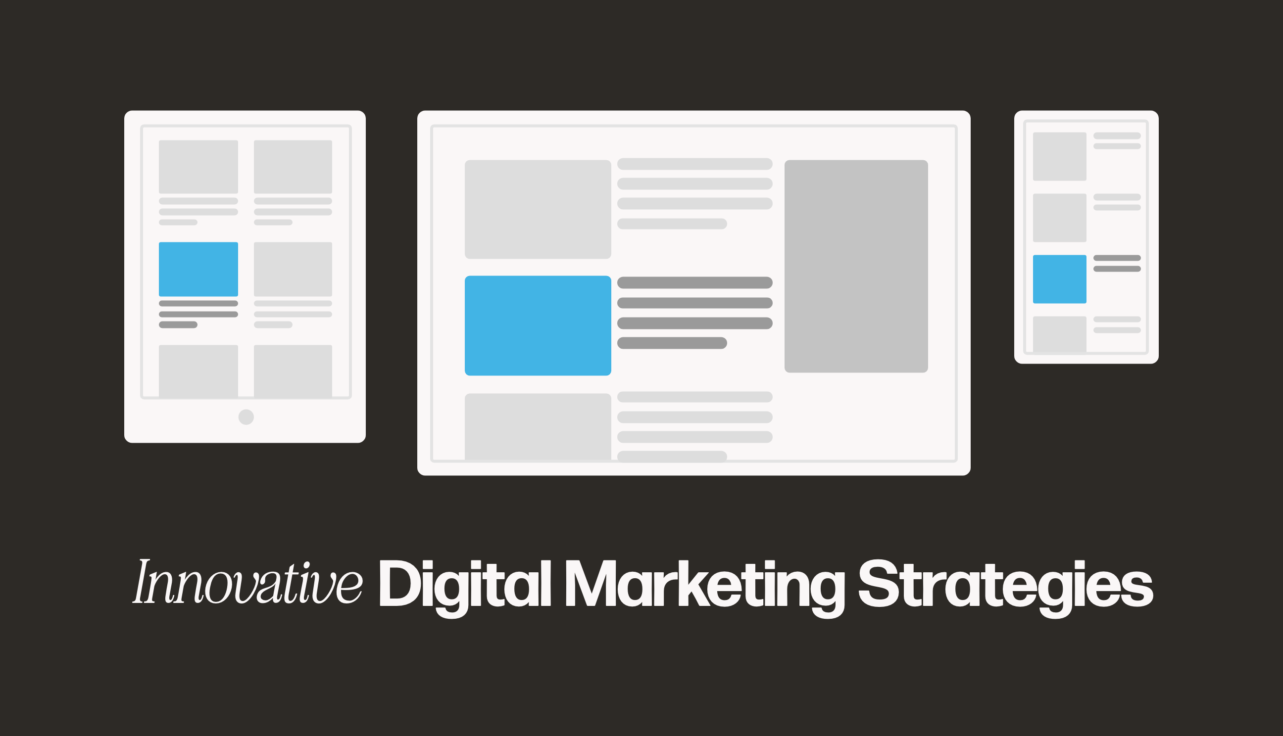
3 Mobile Design Tips for Your eCommerce Website [VIDEO]

By Stacy | Sep 21, 2018 (5 min read)
Did you know that 84% of retail shoppers use their smartphones to assist with a purchase? Now more than ever, it is important that your website is mobile-friendly.
Most websites are designed on a desktop computer and then revamped for a mobile platform only after the design is finished. But remember that users have a very different experience depending on which device they use.
Here are three mobile website design tips for your website:
1) Unique Mobile Website Banner
You may have a desktop homepage banner that has a large image with text, and a call to action button. But when you condense all that information onto a mobile device screen, everything is shrunken down and can look cluttered or be illegible.
To make sure this doesn’t happen, create a unique mobile banner. It can be just one image, maybe a tagline, or just a button. Or can you can even remove the banner altogether on mobile and just go straight into the content.
2) Avoid Hyperlinks or Text Links
When using a mobile device, we tap with our finger, instead of clicking with a mouse or trackpad. For this reason, it’s important to avoid text links or small buttons that are difficult for people to tap with a finger.
Ensure that you use larger text, and easy-to-access buttons for your users to have a better mobile browsing experience.
3) Create Short Forms
There is nothing more frustrating than being asked to complete a 20-step form on a mobile device. It makes you want to click away and never return. As a rule, when it comes to forms on mobile websites, make them easy to use and simple (i.e., short as possible).
You can ask for information as simple as a first name and an email. Odds are, if you get this basic information first, you are more likely to be able to contact them down the road. As you build relationships with your customers, you can get more information. We are recognized as a Top California Web Design Agency on DesignRush
Remember, when it comes to mobile website design, make it simple to use and easy to understand. Your mobile visitors will thank you and want to purchase from you.