Why Your Business Needs a Mobile-Friendly Website


By Andy | Jun 27, 2018 (3 min read)
Are you reading this article on a phone or a computer? In 2018, the chances are about 60/40 you’re using a mobile device to view this page rather than a desktop computer.
The phenomenon of mobile computing has now become mainstream. Less than 11 years ago, before the first iPhone was introduced, we didn’t know that we needed constant mobile internet access. Now it has become the norm. Everywhere you go, you’ll see people locked to their phone screens.
Approximately 58% of mobile screen time today is spent on mobile apps of some type (Instagram, Facebook, Spotify, Gaming, Text messages, etc). The rest of the time on mobile is spent on photos, maps, and of course websites.
Look at your Google analytics
Start by reviewing your website visitor data. Once you have Google Analytics set up on your website, you can simply review the usage by type of device.
Just go to Audience > Mobile > Overview. You should see something that looks similar to this:
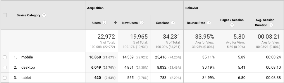
Notice which type of device is the most popular on your website. If it is close to 50% mobile or above, then it is very important to consider the mobile user experience.
Once you have some data, you can start to think about where and when your customers visit your site.
B2C mobile use is increasing dramatically
The research today is showing that the majority of Business to Consumer (B2C) businesses are seeing a spike in mobile use. Additionally, 84% of retail shoppers use their smartphones to assist them during the purchase process.
It actually makes a lot of sense because most consumers use their mobile devices more during leisure time.
This means that if your business attracts direct consumers looking at your products or services, you need to make sure your site is mobile responsive and looks great on all screen sizes.
B2B mobile to desktop ratio is about 70/30
When it comes to business to business (B2B) mobile use, the stats are approximately 70/30 desktop to mobile. This is because we are typically doing business research during office hours, and at a business location with a desktop or laptop computer.
However, as the volume of consumer mobile website visits creeps up, so too does the tendency to visit business websites on a phone or tablet browser.
Planning for mobile website use from the start
Overall, this means that you must be planning your mobile website strategy from very early on in the design process. For many years, it was perfectly fine to build the desktop version of your website and then create a mobile version as an afterthought.
Today, we must do the opposite. The mobile usage (especially for B2C businesses) must be a big consideration. Test and design your website for ease of use, simplicity, and purchases directly through your mobile website.
With the growth of Progressive Web Apps and the Accelerated Mobile Project, we will notice how much easier it becomes to use mobile based websites. The more you can preempt this trend, the better experience your site visitors will have, and the more they will want to buy from you.