Since the onset of the COVID-19 pandemic, shopping in person has become a non-option for many people, and consumers have begun relying on online shopping for their everyday needs.
After the iPhone was introduced in 2007, the world has gone increasingly mobile. It used to be that we did all our web surfing on big clunky desktops, but today the world is available in the palm of our hands.
For this reason, your website is at the core of new lead generation and revenue. Making sure that the way it is displayed to each individual is crucial.
Ensuring your website is attractive and adaptive is crucial, not just for SEO, but for people to stay and buy from you.
The solution to all these challenges is responsive web design, which helps your site visitors have the best possible experience.
This article will look at what responsive web design is and how it can help you grow your business.
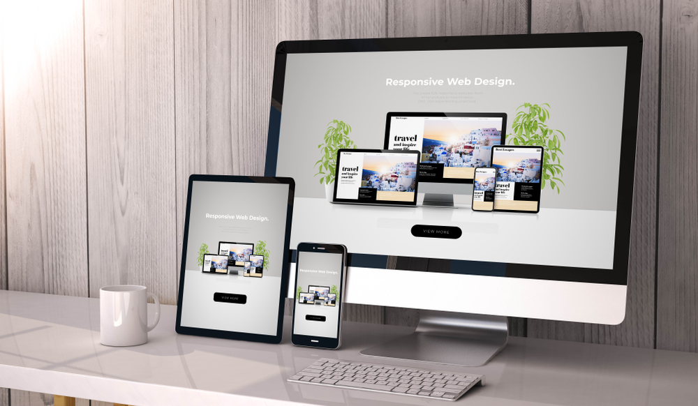
What Is Responsive Web Design?
For a website to be considered ‘responsive,’ the design must adapt to the visitor’s screen size.
In technical terms, the website server sends the code to all devices. The Common Command Set (CCS) then automatically alters the layout and design to match the user’s screen size and resolution.
All images, text, and icons on the website also automatically adjust to ensure the site element is legible, usable, and visually appealing.
The term responsive web design was coined by Ethan Marcotte, a web designer, and developer in May 2010. Marcotte wrote an article titled Responsive Web Design that sparked the movement towards thinking mobile-first when designing for the web.
Since then, most websites’ focus has shifted to the responsive design approach. From big desktop monitors to tablets to smartphone screens, websites today can adapt their content and design to fit and provide an optimal user experience.
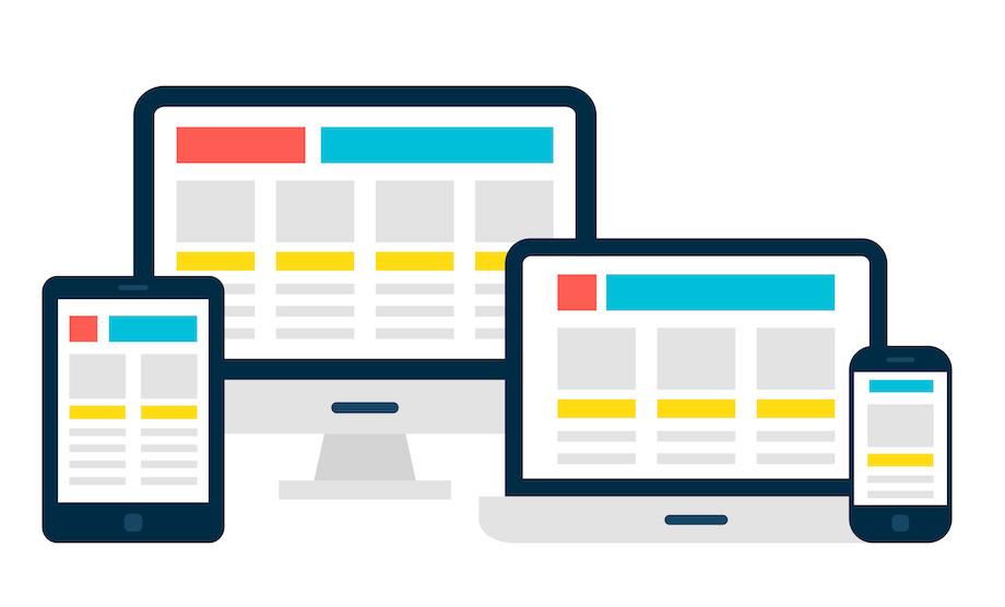
Responsive Web Design ensures your site is readable and usable on all different screen sizes.
Why Is Responsive Website Design Important?
The obvious answer to this question is that since 2017, over 50% of all web traffic is going to mobile devices. Most people today use their smartphones to do their online shopping and browse websites, which is why you should consider a responsive website design.
Google Rewards Responsive Web Design
In the past few years, search engines have realized just how crucial an excellent mobile experience is.
In 2016, Google began favoring mobile-first websites (meaning sites designed with the mobile version as a priority). According to Google’s post on their developer’s blog:
“To make our results more useful, we’ve begun experiments to make our index mobile-first. Although our search index will continue to be a single index of websites and apps, our algorithms will eventually primarily use the mobile version of a site’s content to rank pages from that site.”
This means that the Google algorithm crawls the mobile version of the content and prioritizes mobile user experience over desktop.
If your mobile website loads slowly and the design does not adjust appropriately according to the device size, it negatively impacts the user experience and can damage your SERP rankings.
In 2021, responsive web design is paramount, because as of late 2020, Google has shifted all websites over to mobile-first indexing. Google estimated that about 70% of websites were already using responsive design and that it was time to move the entire ecosystem to mobile-first indexing.
Google has a significant ranking update due to land in March 2021 called Core Web Vitals. It has already begun to set the expectations for what this means for webmasters and responsive web design agencies.
The Core Web Vitals update is entirely focused on online user experience, so if your website is not user-friendly, loading quickly, and using responsive design, it will not compete in the highly competitive online marketplace.
If your website is not up to these standards, working with a digital marketing company can be a great way to add responsive design to your website.
How to Implement Responsive Web Design
While most new websites will have responsive web design built into their code, it might be worth looking at updating for older sites.
Of course, updating your website for a better mobile experience would be impossibly tedious and require hours of labor if you tried to do it yourself.
In 2021, there are hundreds of screen sizes and resolutions that your site needs to adapt to. But there are many digital marketing solutions out there that can help you take care of this challenge.
Responsive website design or a website overhaul might be needed to bring your current site up to standards and keep it ranking well in the search engines.
Adopting responsive means that you will save time changing your site in the future.
The frequency at which companies are releasing new devices is overwhelming, so ensuring your design is responsive now means that your site can evolve and adapt to new technology in the future.
Adding Code for Responsive Website Design
If you want to add a responsive web design to your current website, there are manual code changes that can be implemented. Here are the basics for adding code for responsive web design.
A Meta Viewport Tag
Without a viewport meta tag, mobile devices render pages at typical desktop screen widths and then scale the pages down, making them difficult to read. Setting the viewport meta tag lets you control the viewport’s width and scaling so that it’s sized correctly on all devices.
Using a meta viewport value width=device-width instructs the browser to resize the page according to the screen size. The code will look like this:
<meta name=”viewport” content=”width=device-width, initial-scale=1.0″>
Responsive Images
Like the name suggests, responsive images will automatically adjust to fit the size of the screen.
To make an image responsive, the CSS width property is set to 100%, and the image will scale up and down.
<img src=”img_girl.jpg” style=”width:100%;”>
Because this may cause the image to scale larger than its original size, it is sometimes preferred to use the max-width property instead.
<img src=”img_girl.jpg” style=”max-width:100%;height:auto;”>
This code will instruct the image to scale smaller or larger depending on the screen size, but it will never scale larger than the original screen size. This ensures that the image remains clear.
Another option is to instruct the browser to display different images to adapt to the viewer’s screen size.
Responsive Text
Responsive text is an approach to make texts on a web page that can be read well on various devices and screen sizes. It does not only mean changing size on a different screen. It covers good readability and cohesion between text and elements that surround it.
The text size can be set with a “viewport width” unit or “vw.”
That way, the text size will change to the size of the browser window:
<h1 style=”font-size:10vw”>Good Morning</h1>
Keep in mind, this information may only be helpful if you have some experience with code and website development. If you are not experienced, it may be worth working with a UI development agency.
Responsive Web Design Helps Your Business Grow
All websites have a purpose. For business owners, their websites are designed to grow brand recognition, increase sales and revenue, and grow brand trust.
Whether you want your site visitors to fill out a form, buy a product, subscribe to a service, the design elements will help or hinder your goals. For ecommerce websites, if your product images are cropped or too small, your design can look unprofessional, negatively impacting the visitor’s opinion of your product or service.
Remember that the Google algorithm is actively looking at your website’s user experience. The more time you take to make your visitor’s experience positive, the more Google will reward you with better SERP rankings.


